Case study, self-initiated
A store that only had to look good, rebuilt to actually work.
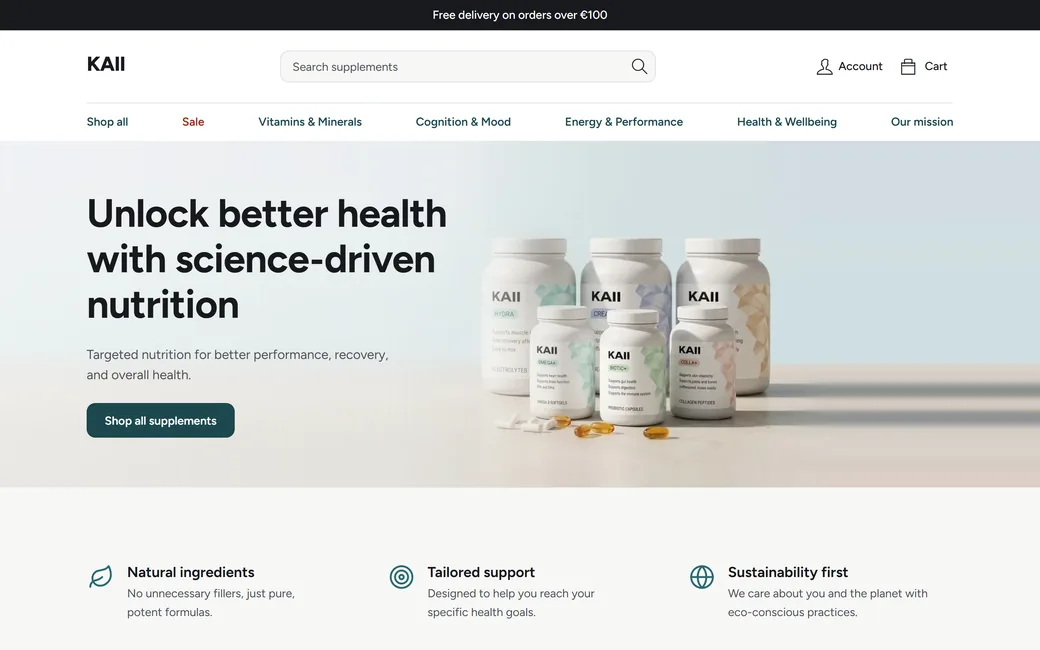
KAII started in Figma as a supplement store concept, made for the way it looked. This is what changed when I rebuilt it as a working store: fewer buttons, real contrast, fewer colours, a clear call to action, and a checkout and an owner panel that really run.
- Project
- KAII, demo store
- My role
- UX/UI design, build
- Timeline
- Concept 2025, build 2026
- Tools
- Figma, WordPress, WooCommerce, Bricks, Claude Code
Read this first
KAII is a demo, not a running business. Prices, reviews, product texts and the numbers in the owner panel are sample data, so this case study shows decisions, not sales.
01 The starting point
It was designed to be looked at.
The idea behind the first KAII was simply to be beautiful, and on a portfolio page it was. Once I imagined someone trying to buy magnesium from it, four problems stood out.
-
Problem 1
Too many buttons.
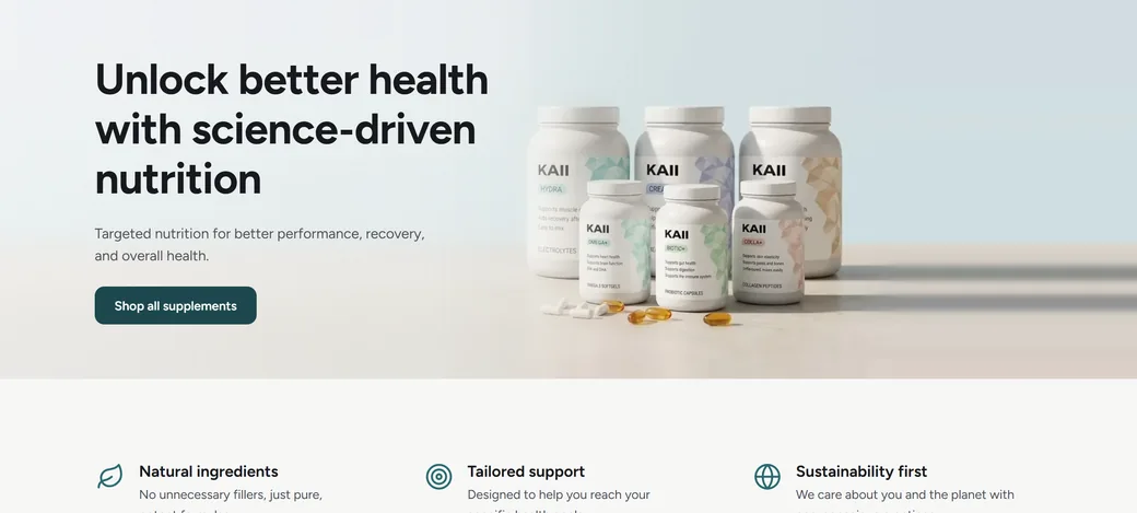
28 button-like controls on the home page alone, in six different looks.
-
Problem 2
Weak contrast.
The main button text, the grey text and the text on the photo all fall short of AA.
-
Problem 3
Too many colours.
Teal, dark teal, navy, blue, peach and beige, all asking for attention at once.
-
Problem 4
No call to action.
A dark button on a dark photo, and product cards with no word on them that says buy.

02 Buttons
One main action, and it always looks the same.
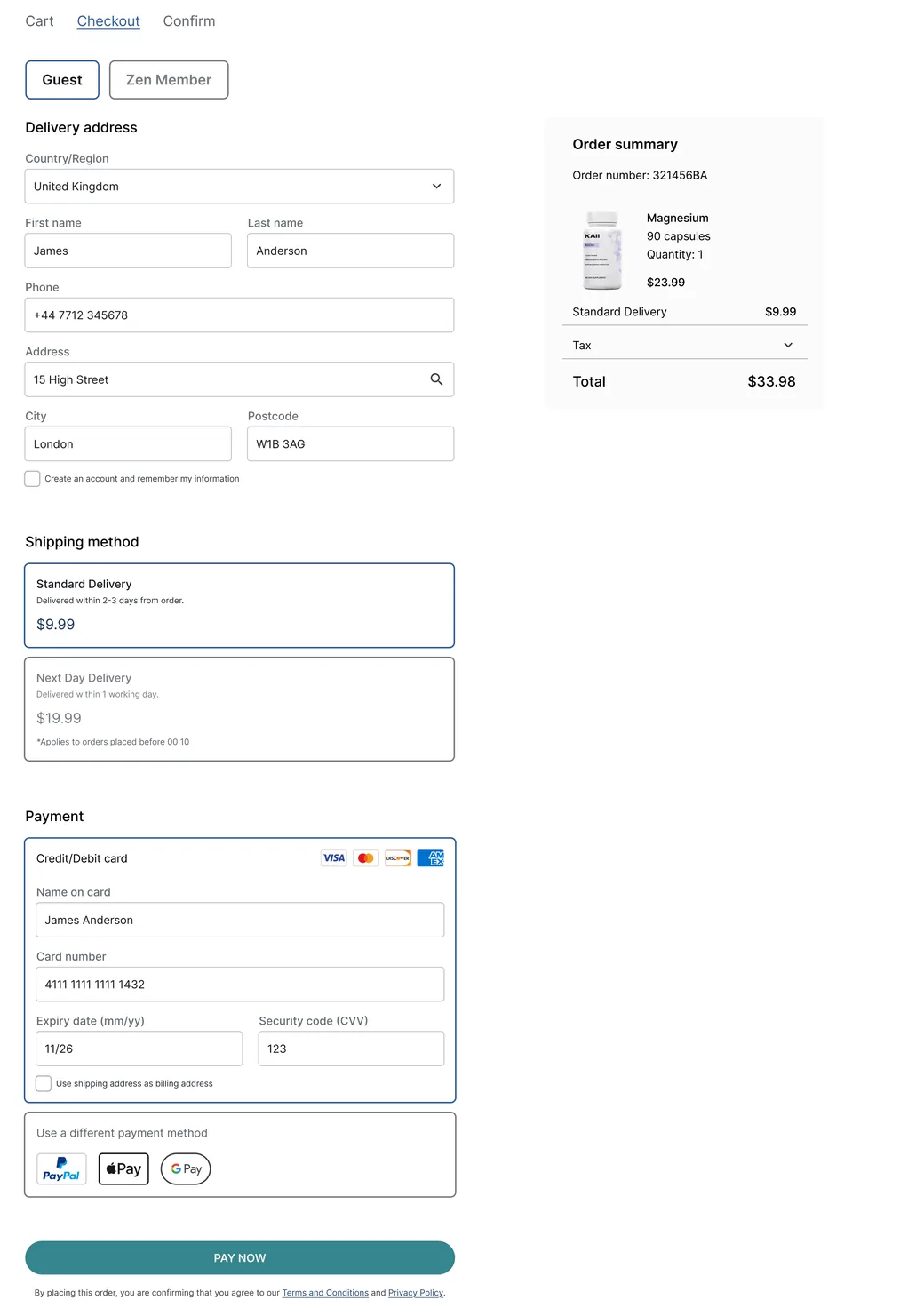
Across the old screens a button could be a teal pill, a dark pill with an arrow, a navy rectangle, a blue rectangle, a dark square block or a thick outlined pill, with nothing to say which one mattered. Now there are three kinds and each has one job: filled for the main action, outlined for a secondary one, plain text for the rest. All of them share one corner radius, 12 pixels.
- 1 down from 5Colours used to fill a button across the screens
- 16 down from 28Button-like controls on the home page, and all of them now have a label
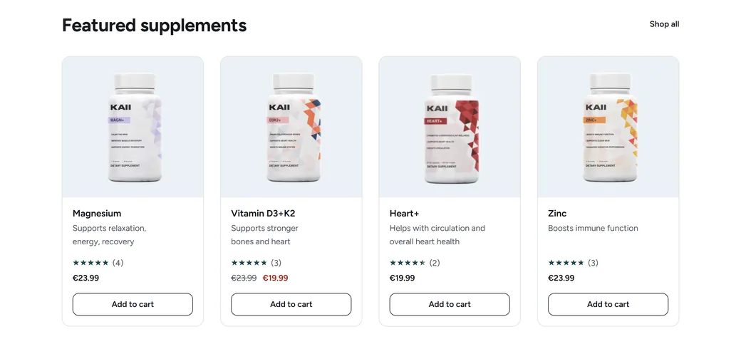
- 0 down from 24Unlabelled heart and bag icons on the home page product cards
03 Contrast
I measured it instead of trusting my eye.
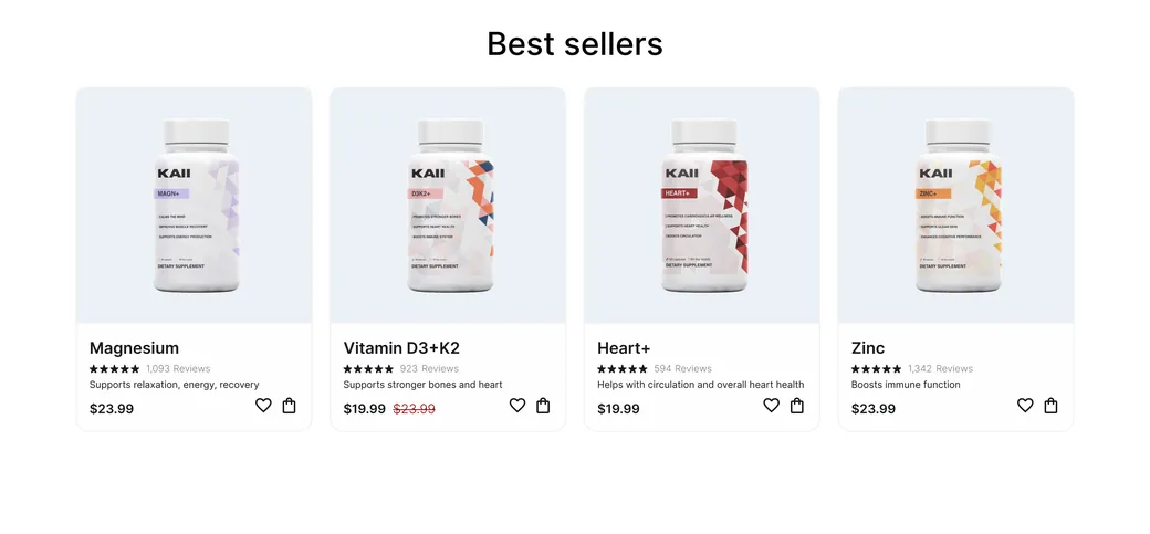
WCAG AA asks for 4.5:1 on normal text and 3:1 for the shape of a control. I sampled the old colours from the pixels of the Figma exports and read the new ones from the browser. The brand teal, #35858D, never reaches AA under white text, so buttons moved to the darker #1D484E from the same family.
| Where | Before | After |
|---|---|---|
| Text on the main button | 3.84:1 fails | 10.05:1 passes |
| Line under the hero headline, over the photo | 3.89:1 fails | 6.92:1 passes |
| Grey text on white | 4.18:1 fails | 8.35:1 passes |
| Grey text on a card or panel | 4.04:1 fails | 7.79:1 passes |
| "Away from free delivery" amount | 4.29:1 fails | 17.56:1 passes |
| Shape of the hero button against what is behind it | 2.36:1 fails | 8.35:1 passes |
Text over a photo has no single ratio, so those two rows are the median across the text area. The Figma figures are read from exported images, not from the Figma file.
04 Colour
The bottles carry the colour now.
The old pages stacked a blue band, peach circles, a beige band and three kinds of blue text. Each one was pretty and together they left nothing to look at first. The new palette is mostly ink and quiet greys, one deep teal for action and one red that only ever means a sale, in the Sale link and on sale prices. So the colour on the labels is what stands out.
Before, sampled from the exports
- Teal#35858D
- Dark teal#1D484E
- Darker teal#16383A
- Navy#274873
- Blue#305C93
- Peach#F1B18E
- Pale blue#EBF3F5
- Beige#F3F2EF
After, read from the store
- Ink#18191D
- Soft ink#4A4E56
- Action#1D484E
- Sale#A3261B
- Mist#EBF2F5
- Surface#F7F7F6
- Paper#FFFFFF
- Line#DADDE1
05 The call to action and the way to buy
From looking to buying, without searching for the button.
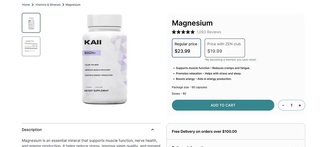
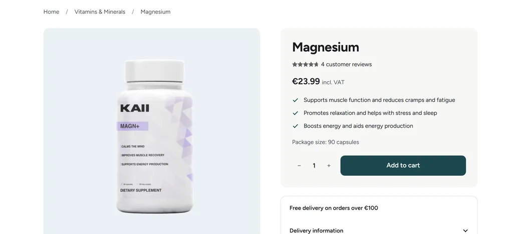
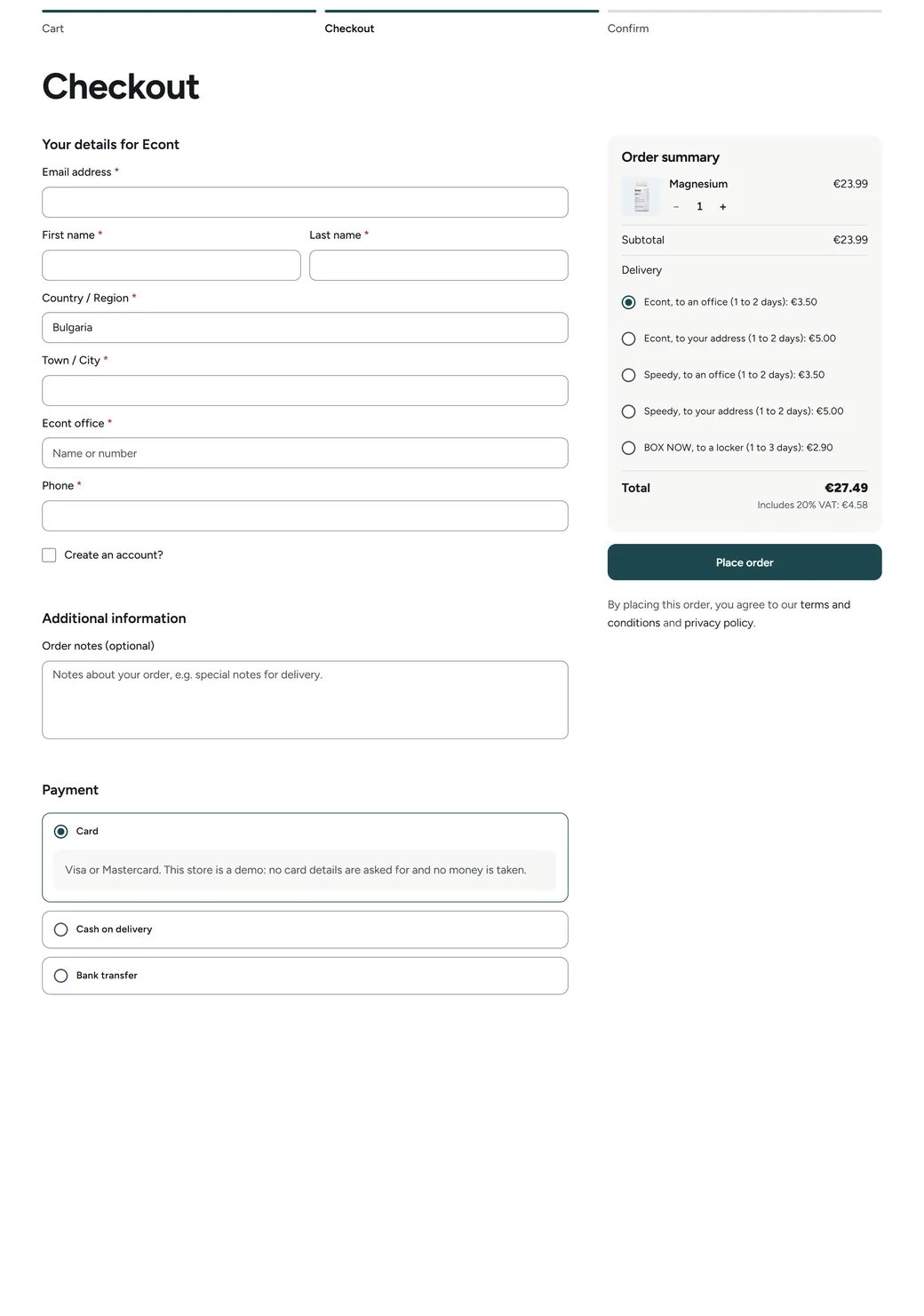
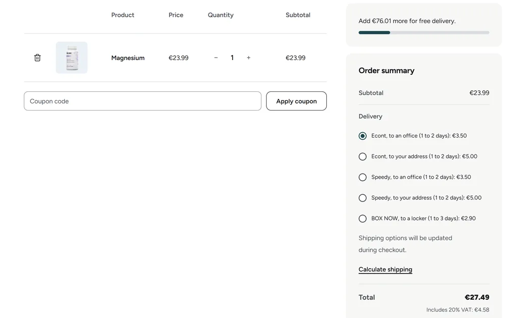
The old hero button was 170 by 40 pixels in dark teal on a dark photo, and the cards offered a bag icon of 16 by 20. Now the first screen has one solid button, every card says Add to cart in a button 44 pixels tall, the starter pack is added with one press, and on a phone a bar with the name, the price and the button stays in reach.
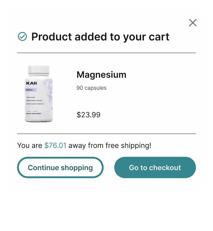
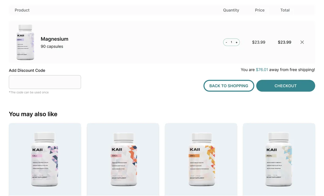
- Add to cart. The side cart opens where you are and shows how much is left until free delivery.
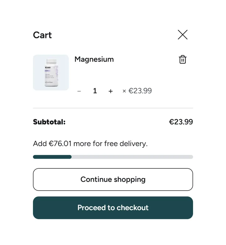
- Proceed to checkout. Or carry on shopping: one button is filled and the other outlined, so the order is clear.
- Seven fields, one already filled. Email first, then the courier's details. Choosing an office or a locker hides the address fields.
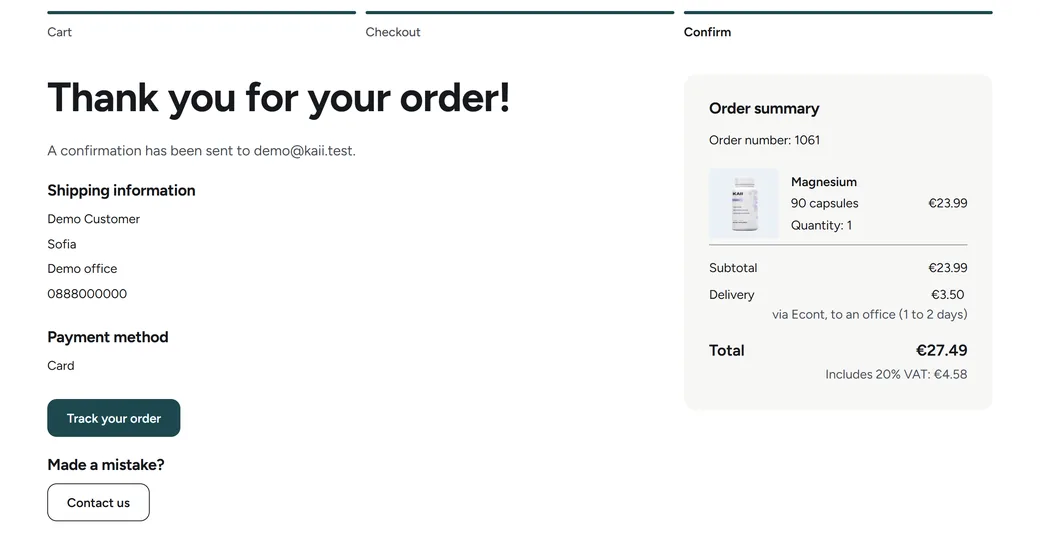
- Place order. The summary stays in view with the delivery and a total that already includes VAT.
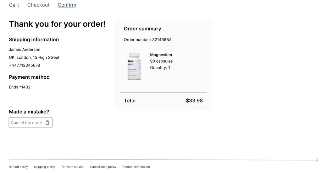
- Thank you, then Track your order. The confirmation leads somewhere useful, not back to the start.
06 A store that really works
Now there is a back of the shop.
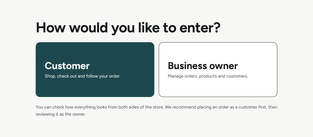
In Figma, nothing happened when you pressed a button. The new KAII runs on WooCommerce and Bricks, so products, prices and text stay editable without code. It opens by asking who you are, a customer or a business owner, because the point of the demo is to place an order and then see it arrive on the owner's side.
-
The customer's side
The whole way through an order.
24 products, filters and sorting, search suggestions, cart, checkout with VAT, Econt, Speedy and BOX NOW, an account and order tracking.
-
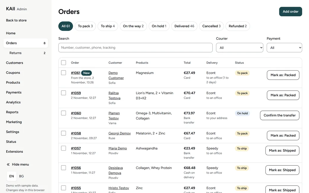
The owner's side
A panel built around the daily work.
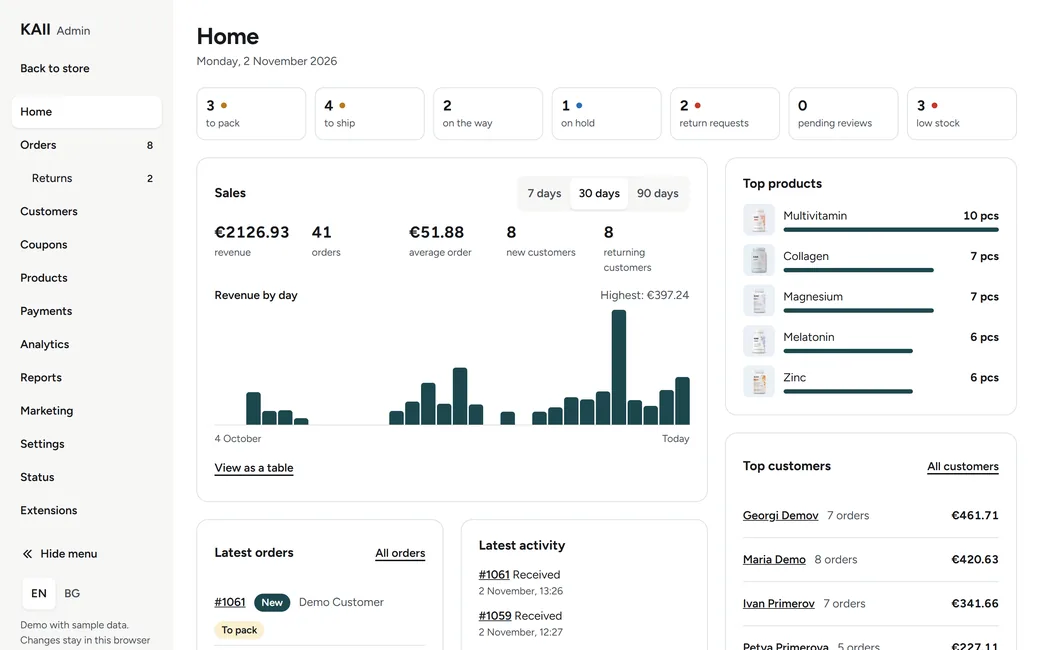
WooCommerce's menus in KAII's design: what to pack today, orders moved one step at a press, returns, coupons, stock and customers, in English or Bulgarian.
What it is not, yet
-
Payments
No real money moves.
No payment provider is connected. The card option is a demo that asks for no card details.
-
Couriers
No courier link.
The couriers and their prices are examples. The office name is typed by hand.
-
People
Not tested with customers.
So there are no conversion numbers here. Nobody has bought anything from it.
07 Before and after
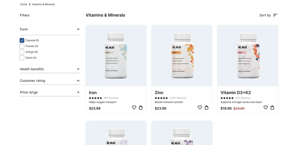
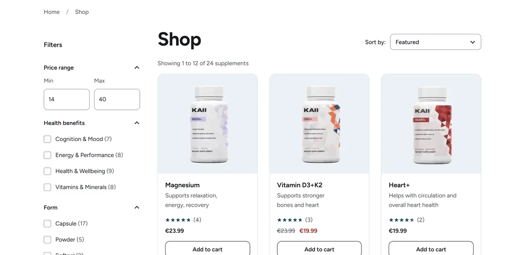
The same store, page by page.
08 Goals for the future
What can come back, once it really works.
Part of the concept was taken out because it was only a drawing. These are the first things I would bring back, built for real this time. None of them exists yet.
-
Next 1
Zen club and its offers.
The membership from the concept, back as an actual place to join, with offers for its members.
-
Next 2
A questionnaire.
A short set of questions that helps you find which supplements you need.
-
Next 3
Monthly delivery.
A subscription that brings your supplements to you every month.
KAII
Need a store like this?
Tell me what the business is after and I will tell you how I would approach it.